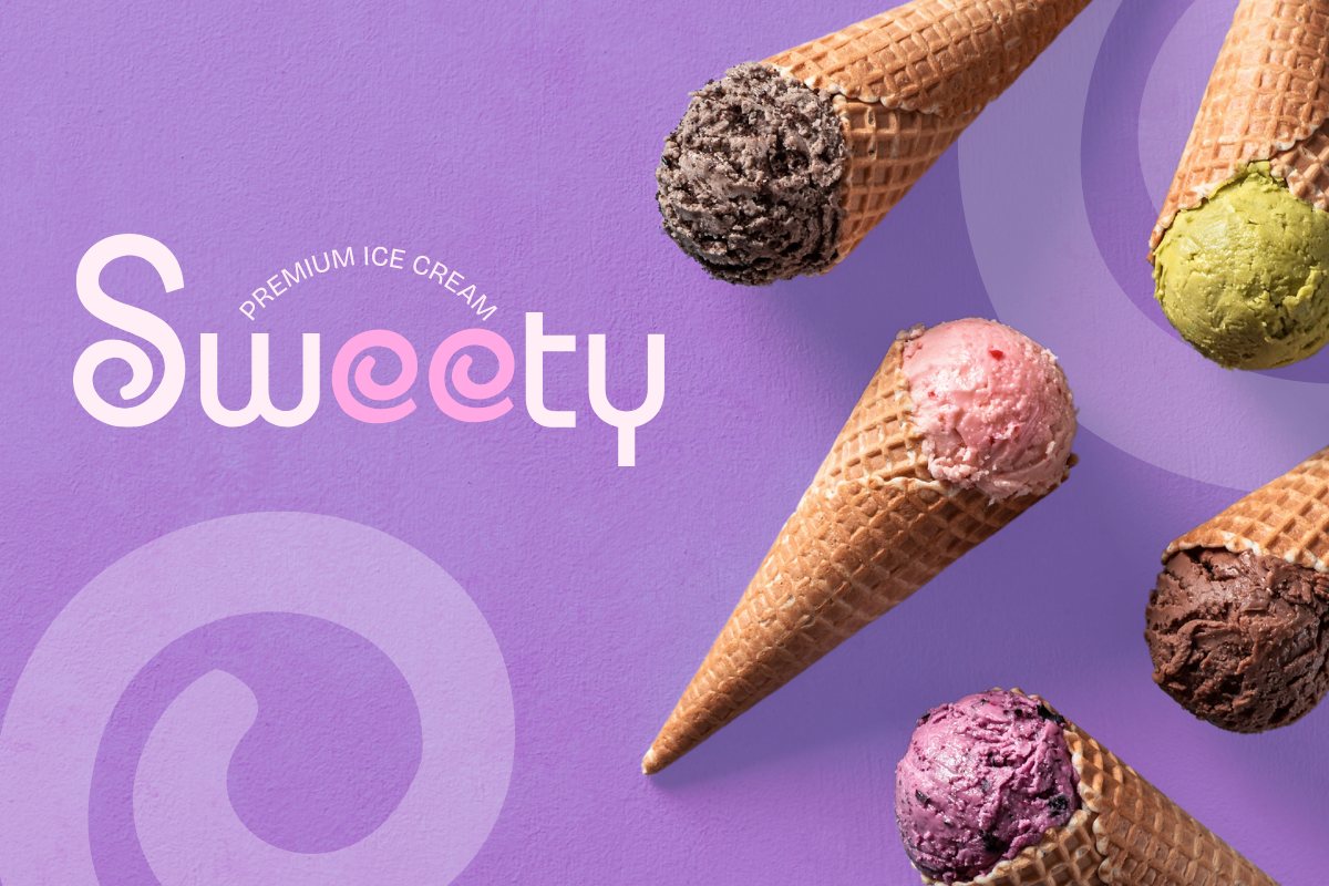
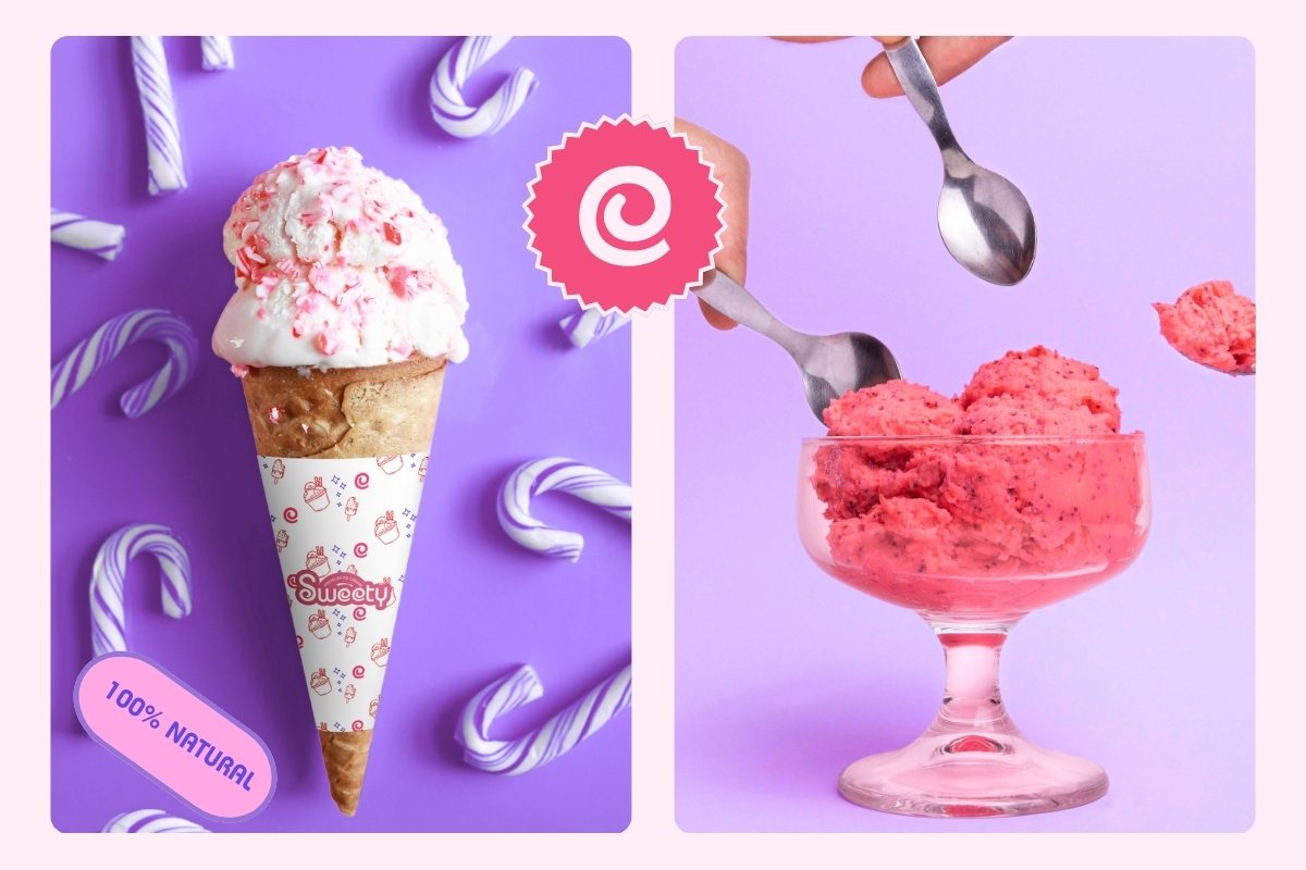
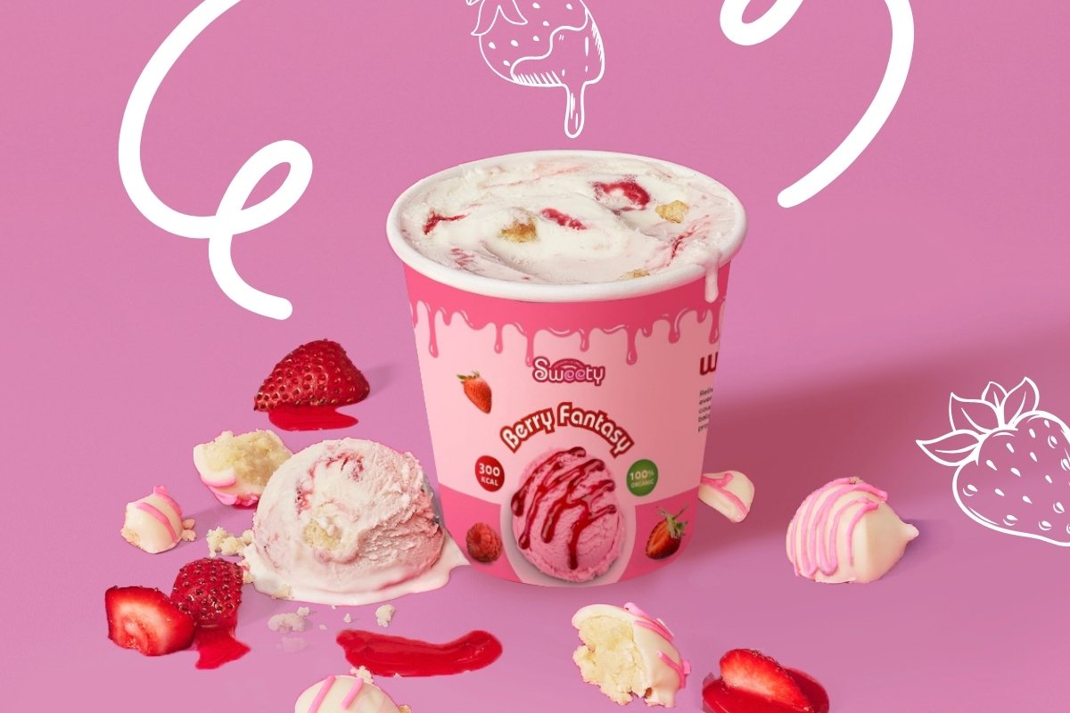
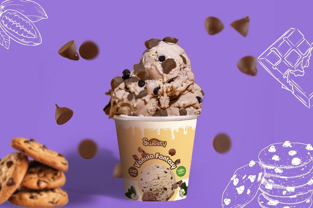
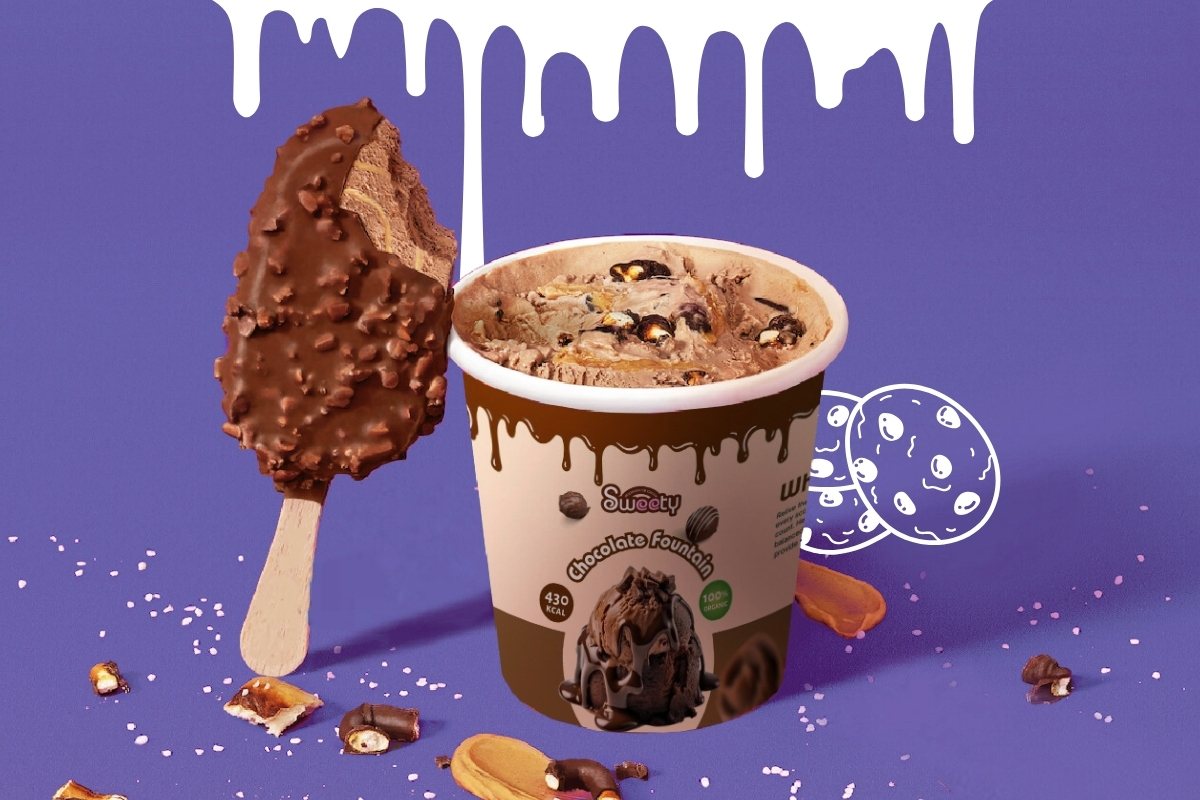
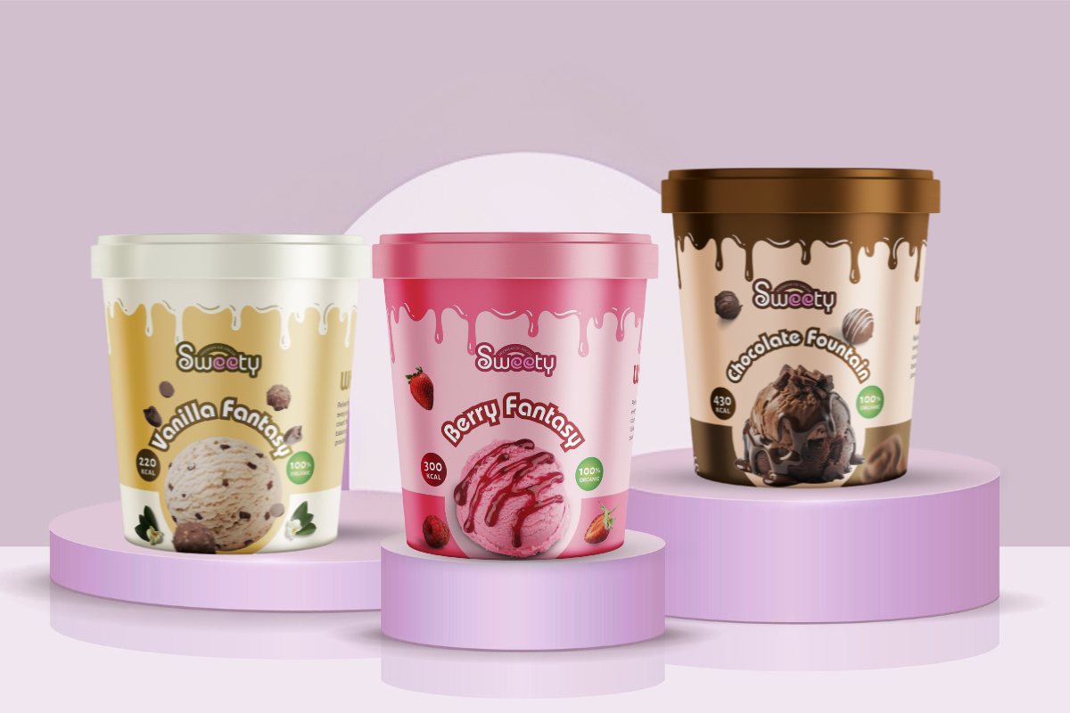
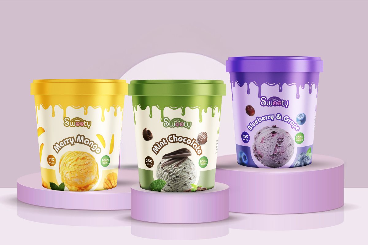
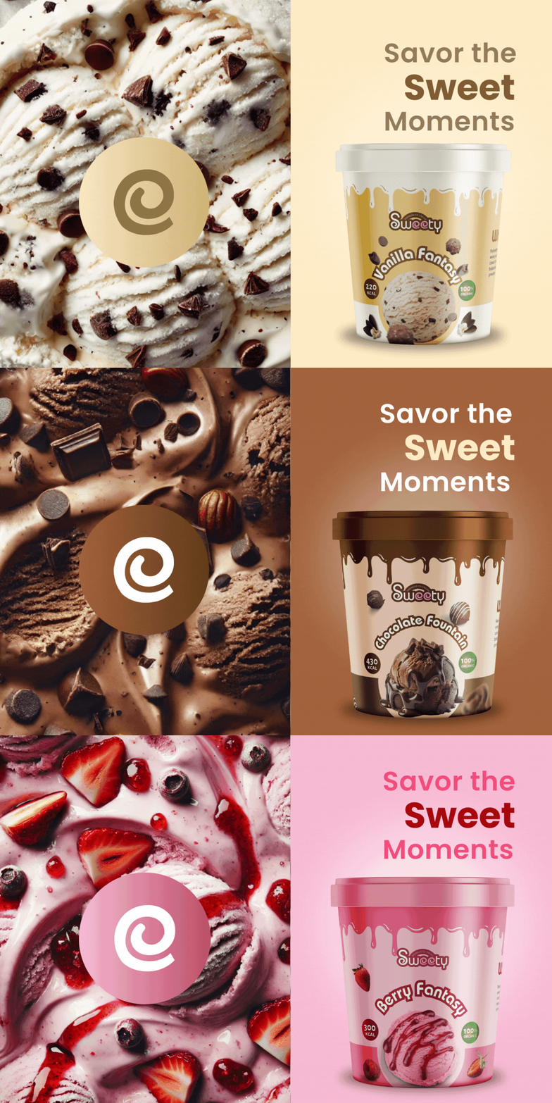
The “Sweety” ice cream brand successfully integrates playful design with a premium feel, making it stand out in the competitive ice cream market. The brand identity, marked by its vibrant and dynamic logo, strategic color palette, and engaging imagery, creates an inviting and enjoyable visual experience for its audience.
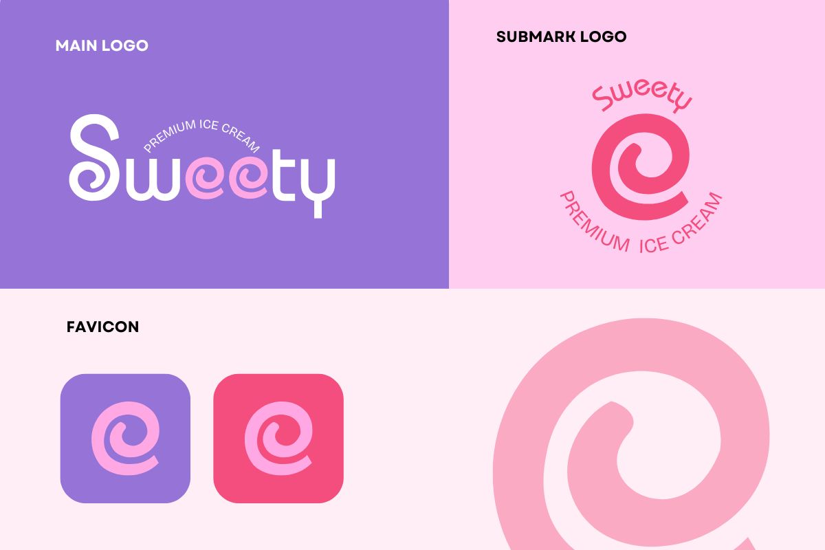
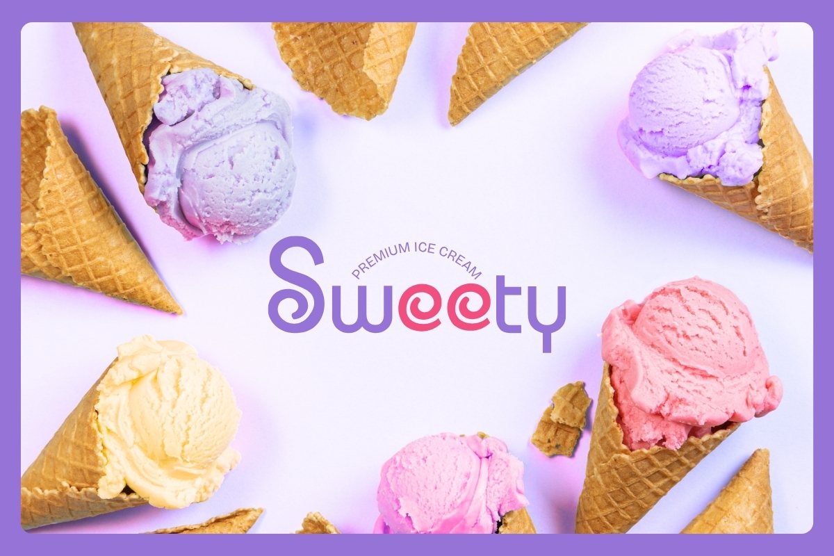
The logo’s distinctive typography and color scheme communicate both fun and quality, appealing to a broad demographic that includes both children and adults. The tagline “Premium Ice Cream” reinforces the high-quality nature of the product, while the playful elements highlight the fun and delightful experience of enjoying ice cream.

Analysis of Logo Design and Identity
The “Sweety” ice cream logo combines playful and unique typography with a vibrant color scheme to create a memorable and appealing brand identity. The abstract ‘e’ in the logo cleverly represents rolled ice cream, while the distorted ‘S’ adds a fun feel and echoes the same concept.
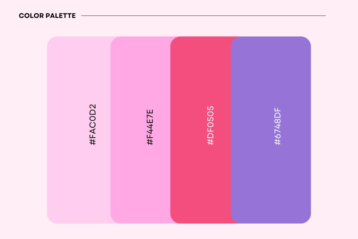
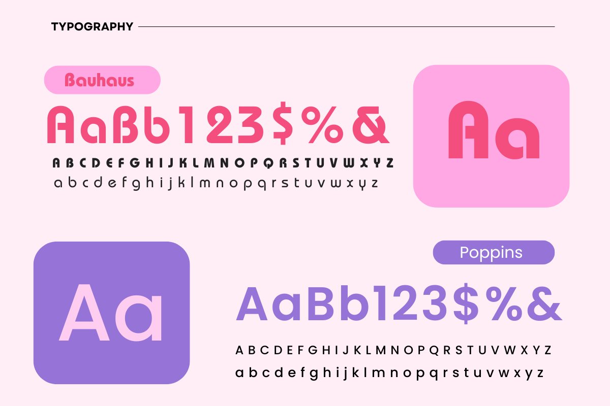
The color palette communicates the brand’s essence of being both premium and playful, making it attractive to a wide audience.The color palette, featuring shades of pink, red, and purple, evokes feelings of sweetness, excitement, and creativity. These colors are not only visually appealing but also strategically chosen to align with the brand’s message of premium quality and enjoyment.
Analysis of Color Palette
Pink shades evoke feelings of sweetness, love, and fun.
The use of two shades of pink adds depth and variety, making the visuals more engaging.
Red is a bold color that signifies excitement and passion.
Its inclusion in the color palette adds a pop of energy and can help highlight key elements in the branding.
Purple is associated with creativity, luxury, and quality

Your business deserves to stand out with a brand that tells your unique story. Let me help you create a brand that you’ll proudly showcase to the world, capturing the essence of who you are and transforming potential leads into loyal customers.