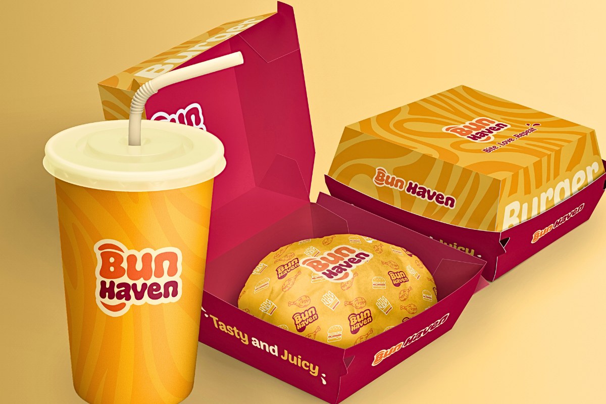
Bun Haven is where burger lovers find their paradise. Nestled in the heart of the city, Bun Haven serves juicy, flavorful burgers crafted with the freshest ingredients. The burgers here aren’t just meals; they’re experiences that bring joy and satisfaction with every bite.
Tone and Style:
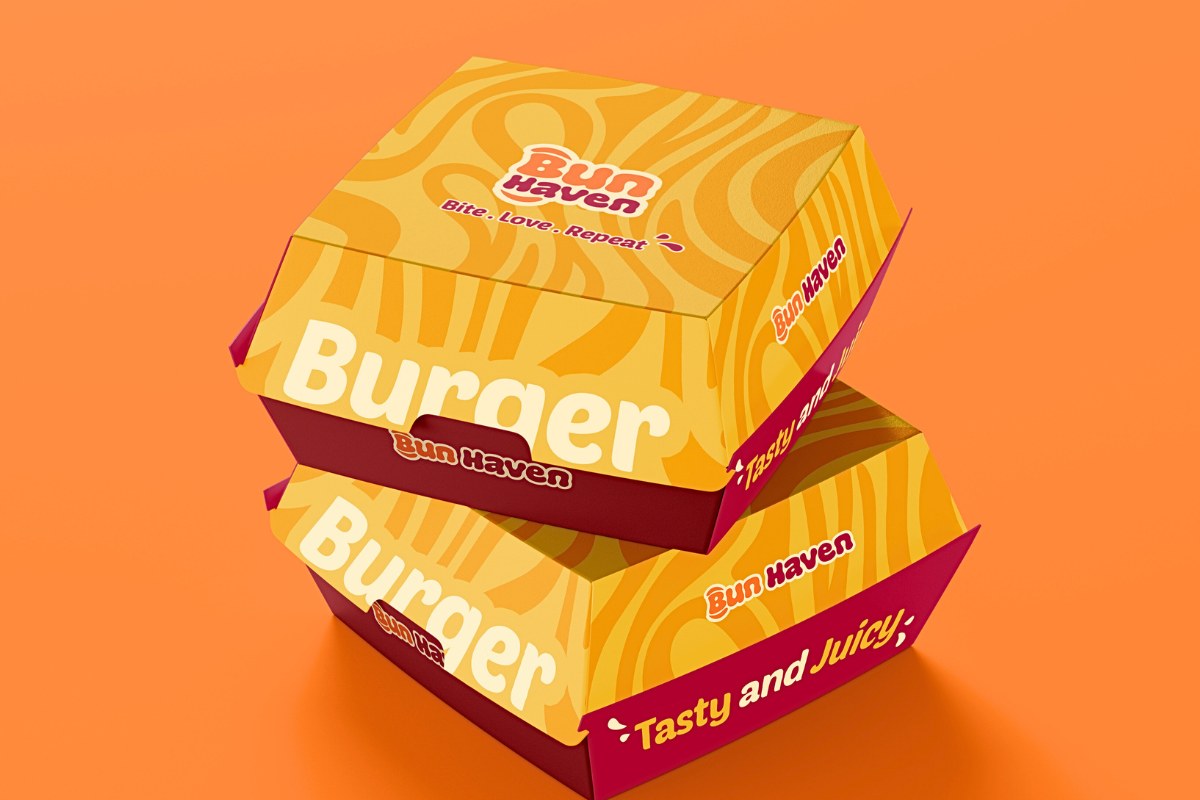
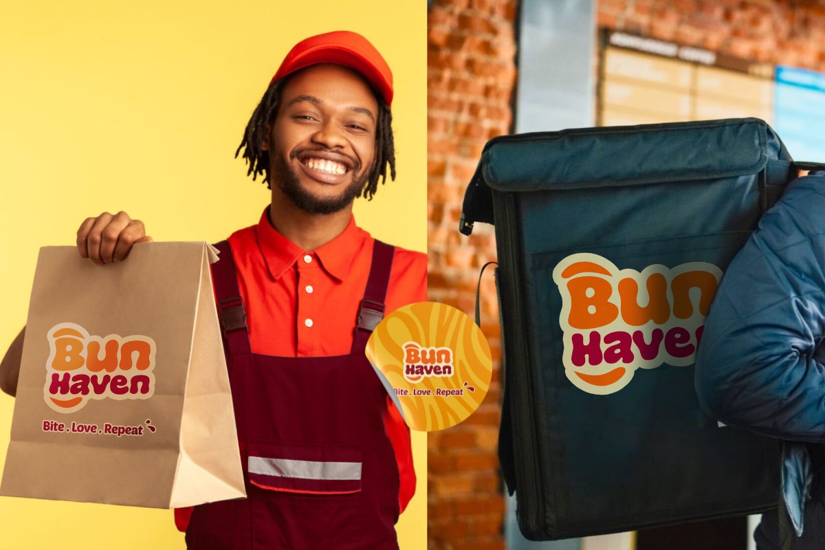
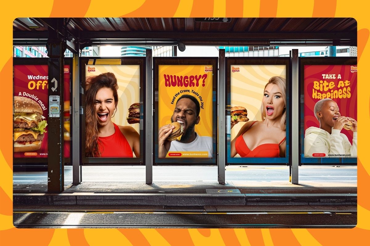
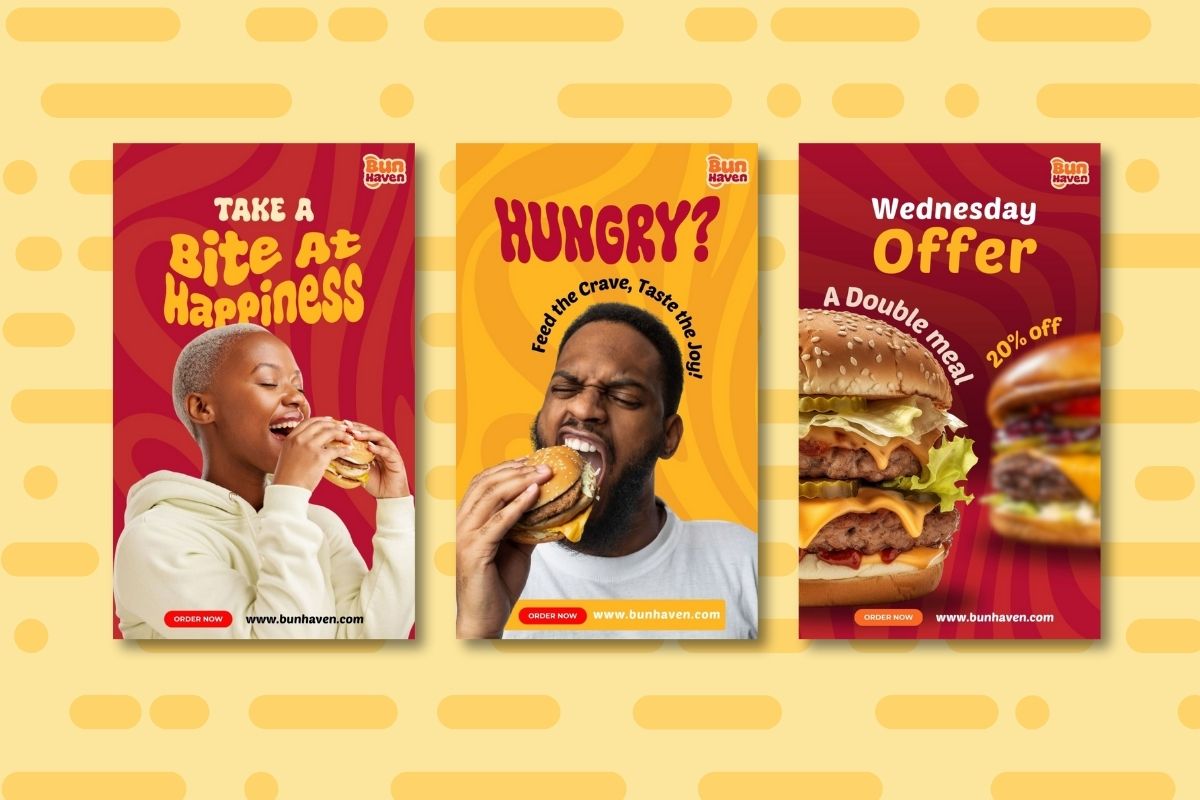
Bun Haven’s brand tone is lively, approachable, and full of zest. The bright yellow and red used in the branding is often associated with happiness, energy, and optimism, creating an inviting and cheerful atmosphere. This color choice is deliberate, aiming to evoke feelings of joy and warmth, making customers feel at home they experiene the brand.
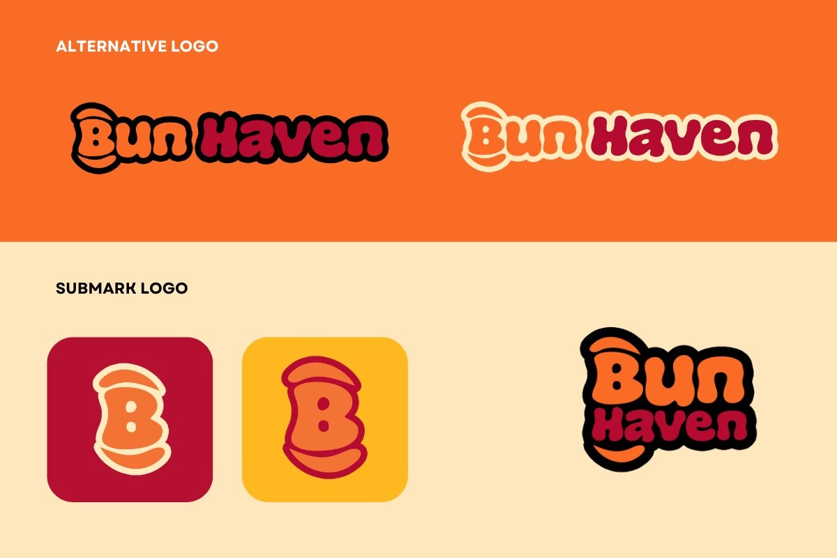
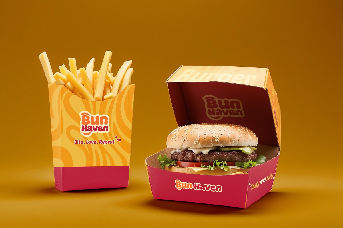
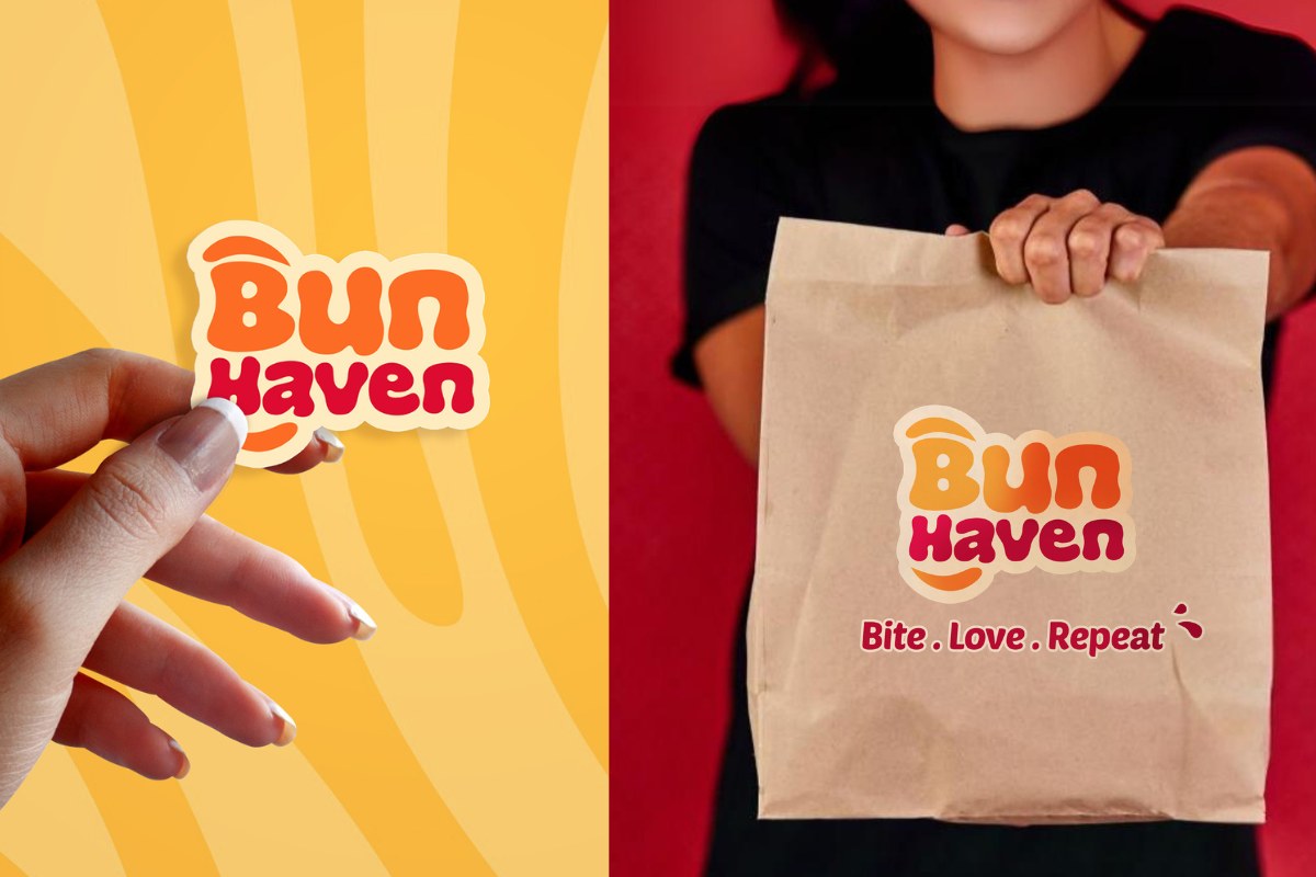
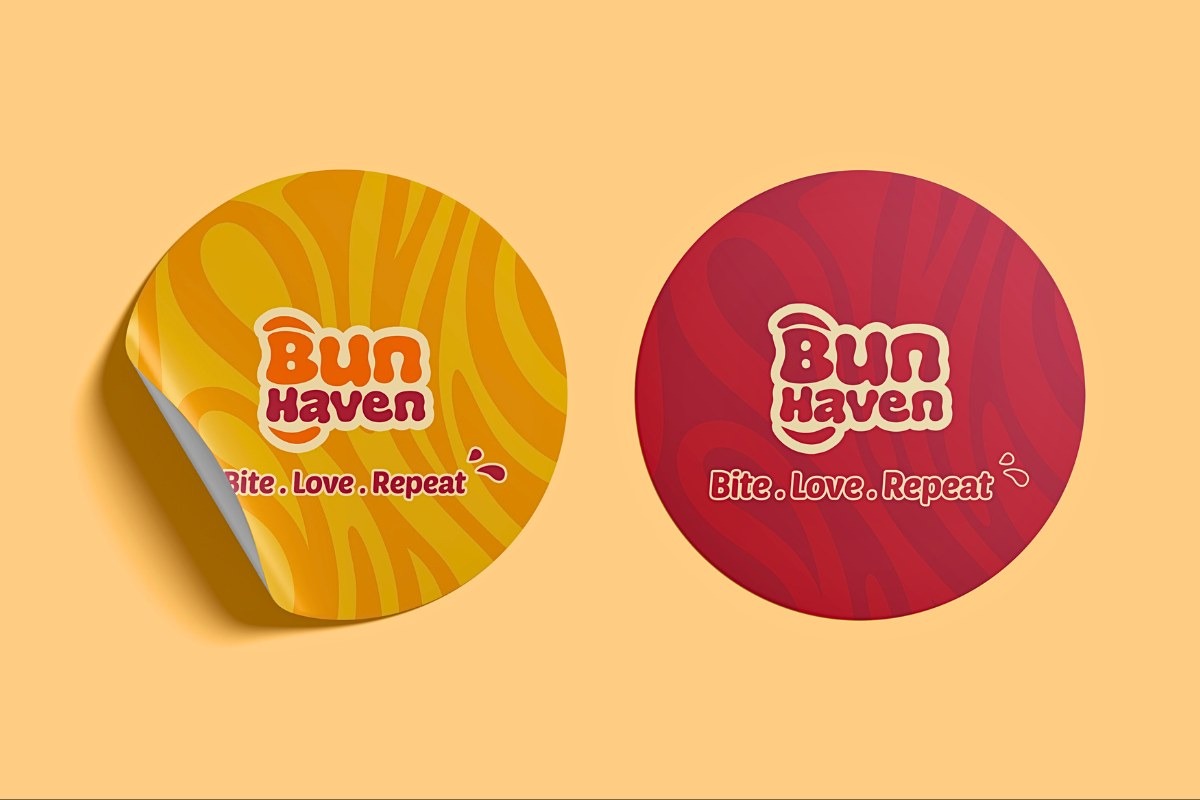
The brand identity of “Bun Haven” is playful and inviting, featuring a vibrant logo with rounded typography in bold orange and deep maroon. The tagline “Bite. Love. Repeat.” encourages repeat visits by emphasizing enjoyment. Abstract curved shapes above and below the “B” in the logo represent burger buns, reinforcing the core product. The color palette, with bright orange and yellow, evokes energy and happiness, while deep maroon adds sophistication. Soft beige and white tones balance the design, making the brand message both inviting and professional. Overall, these elements create a distinctive and appealing identity that stands out in the fast food market.
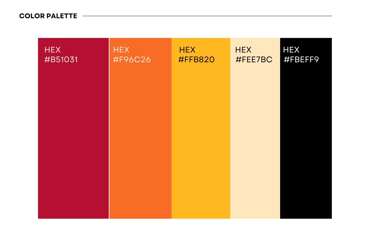
Analysis of Color Palette
#F96C26 (Bright Orange): Represents energy, excitement, and a sense of fun, which are crucial for attracting attention in a fast-paced environment like a fast food restaurant.
#FFB820 (Vibrant Yellow): Evokes feelings of happiness and positivity, and is often associated with food, increasing appetite and creating a warm, welcoming atmosphere.
#B51031 (Deep Maroon): Adds a touch of sophistication and contrast, giving the brand a distinctive and memorable appearance. It also enhances the perception of quality.
#FEE7BC (Light Beige): Provides a neutral balance, softening the boldness of the primary colors and adding a sense of cleanliness and simplicity.
#FBFFF9 (Soft White): Enhances readability and clarity, making the brand messaging stand out. It also reinforces a sense of freshness and hygiene, which are important in food-related branding.
#000000 (Black): Used for text or outlines, providing a stark contrast that ensures legibility and a professional finish.

Your business deserves to stand out with a brand that tells your unique story. Let me help you create a brand that you’ll proudly showcase to the world, capturing the essence of who you are and transforming potential leads into loyal customers.